PROFILEnyc had the exclusive opportunity to sit down with Robert Whitlock, Design Principal of Kohn Pedersen Fox, to discuss designing and transforming some of the most iconic skylines in the world as well as their newly completed Madison Square Park Tower and under construction Waterline Square on the Upper West Side. Get an inside look at where the design inspiration comes from and the process behind some of Kohn Pedersen Fox's most iconic designs in New York City, one of the worlds' most recognizable skylines:
PM: KPF has made its mark on some of the world's greatest skylines, including Hong Kong, Paris and Shanghai. What makes the Manhattan skyline so iconic?
RW: The Manhattan skyline is dynamic due to a number of factors – First, the island’s compression inevitably creates density overlaid with generations of buildings that represent the best of their respective ages. Second, the concentration of height and density at both the center and tip of the island allow one to view its comprehensive expanse from many approaches; it becomes a defining representation of urbanity. Third, the best architects from all over the world are competing to create the best buildings for the most demanding developers in the world.
PM: The Flatiron Building was one of the city’s tallest buildings upon its completion in 1902. What does it mean to have built what is currently the tallest tower between Midtown and Lower Manhattan? Can you talk about Madison Square Park Tower’s impact on the New York skyline?
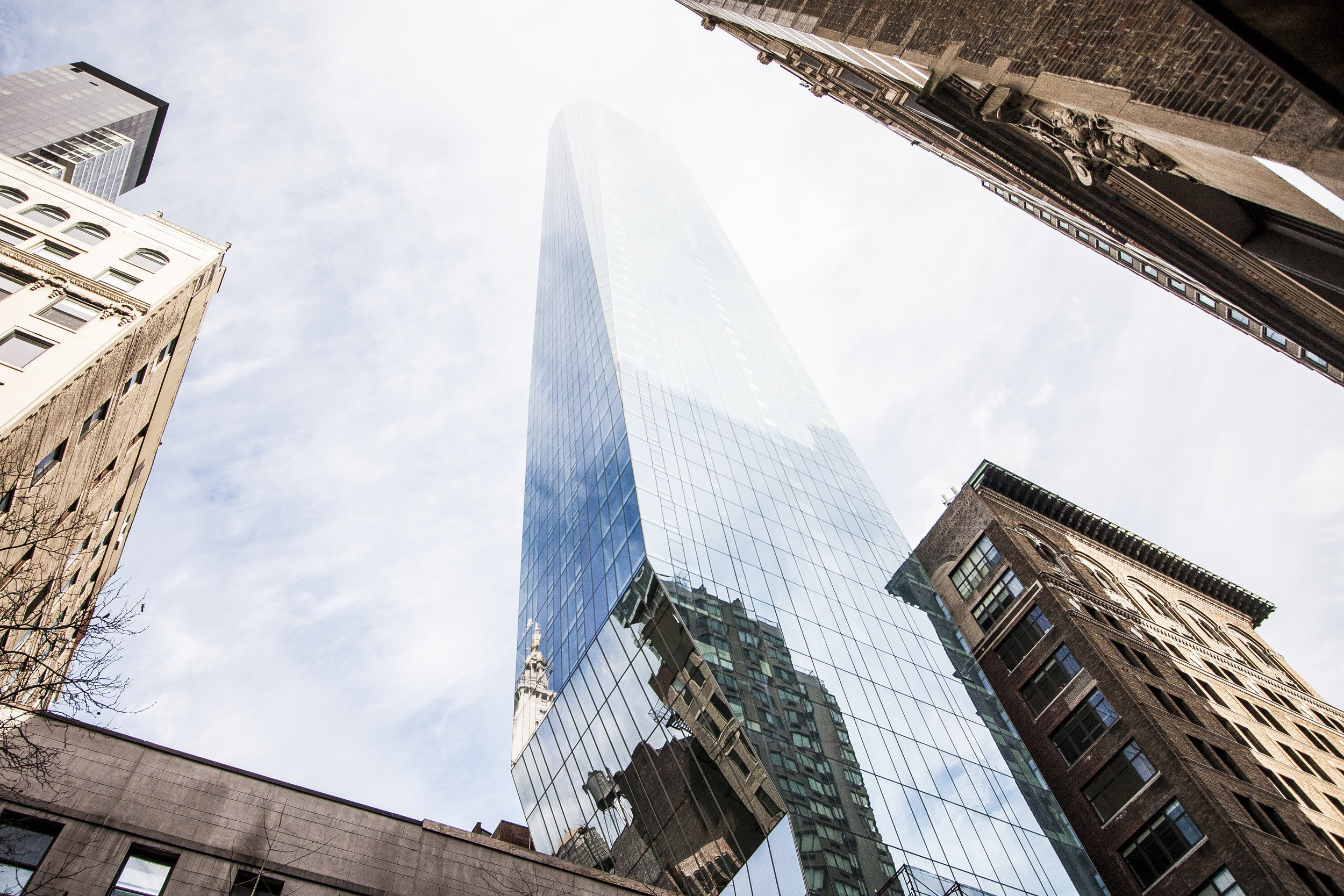
RW: The immediate neighborhood around Madison Square Park is one of the most memorable places in Manhattan because of the character that its buildings contribute to the skyline. The pyramidal, campanile roofs of the Met Life and the New York Life Towers complement the dynamic form of the Flatiron Building to create one of the city’s most romantic assemblages. Since its inception, the design of Madison Square Park Tower intended to engage dialectically with these historic forms, proposing its own crystalline signature for the skyline and a modern interpretation of the tower type. Intellectually, I like to think that there is a straight line from the Flatiron Building to Madison Square Park Tower.
PM: How did KPF become involved with Continuum Company and the Madison Square Park Tower project?
RW: Bruce Eichner invited us to compete for the façade design for a flat-topped building form that he had conceived in-house. In addition to the cladding schemes that he had solicited, we offered a number of massing alternatives that would create unique profiles on the Manhattan skyline. These designs emphasized the formulation of a distinct identity for the individual tower. However, these iterations also heavily considered how the new tower would enter into dialogue with the remarkable roof profiles that already defined that neighborhood.
PM: The building is comprised of a cantilevered tower over a granite base. Where did this design inspiration come from? What led KPF and Continuum Company to choose this design?
RW: The tower’s crystalline glass surface was developed to form an ephemeral yet dynamic presence at the foot of the park – shimmering in the varied light of day so as not to overpower the historic masonry buildings that surround it. Yet the articulation of the tower’s street presence required a more direct dialogue with the masonry buildings, as it would define the pedestrian experience in that vicinity. Bruce also felt strongly that the front door to the tower should feel like the entry to a small townhouse rather than a large commercial project. The result is a rusticated base that channels both the Flatiron Building to the west and a number of the neo-gothic buildings just around the corner on Park Avenue South. Like Brancusi’s “Bird” and other sculptures, Madison Square Park Tower is the juxtaposition of the rough base and the polished form above, each of which adds richness to the understanding of the other.
PM: Can you share a bit about your design process?
RW: During the concept design phase, we focus on a comparative process in which many ideas are tested to ascertain their suitability for the program and appropriateness for context and general appeal. As the design evolves, this same method is applied to the internal planning and the details of the tower’s external expression. In the case of a residential building, its success depends on the units’ layouts, so it is really a process where one is designing from the inside out. Ultimately, both inside and outside inform one another and the final building is the representation of this mediation.
PM: The building’s design is pretty radical. How does the cantilever work?
RW: There are two fundamental ideas at play with the cantilever. The first is the belief that a tapered, cantilevered form has a much more benign impact on the pedestrian experience than that of a brute-force cantilever, which is employed low to the ground with a simply extruded building placed above. The latter presents an undersurface in shadow that looms over the sidewalks below, while the former recedes in perspective into the sky and seems no larger than the very small floorplate at the base of the tower. From a structural standpoint, the cubic approach of the sloping columns were more easily resolved into the base that the large truss forms. Conversely, the increased slab thickness—which the sloping columns were required to reconcile—adds force to the mass at the top of the tower. This reduces acceleration forces due to wind loads. From a planning perspective, the varied floor plate sizes over the height of the tower allowed for a more responsive set of unit layouts, where different apartment sizes and configurations could be combined in a tailor-made fashion—one that a simply extruded floor plan would not have allowed. The tower form, while appearing to be the driver of the design, is actually a result of the complex interior planning.
PM: What are some of the contributing factors that come into play when designing a residential skyscraper in Manhattan?
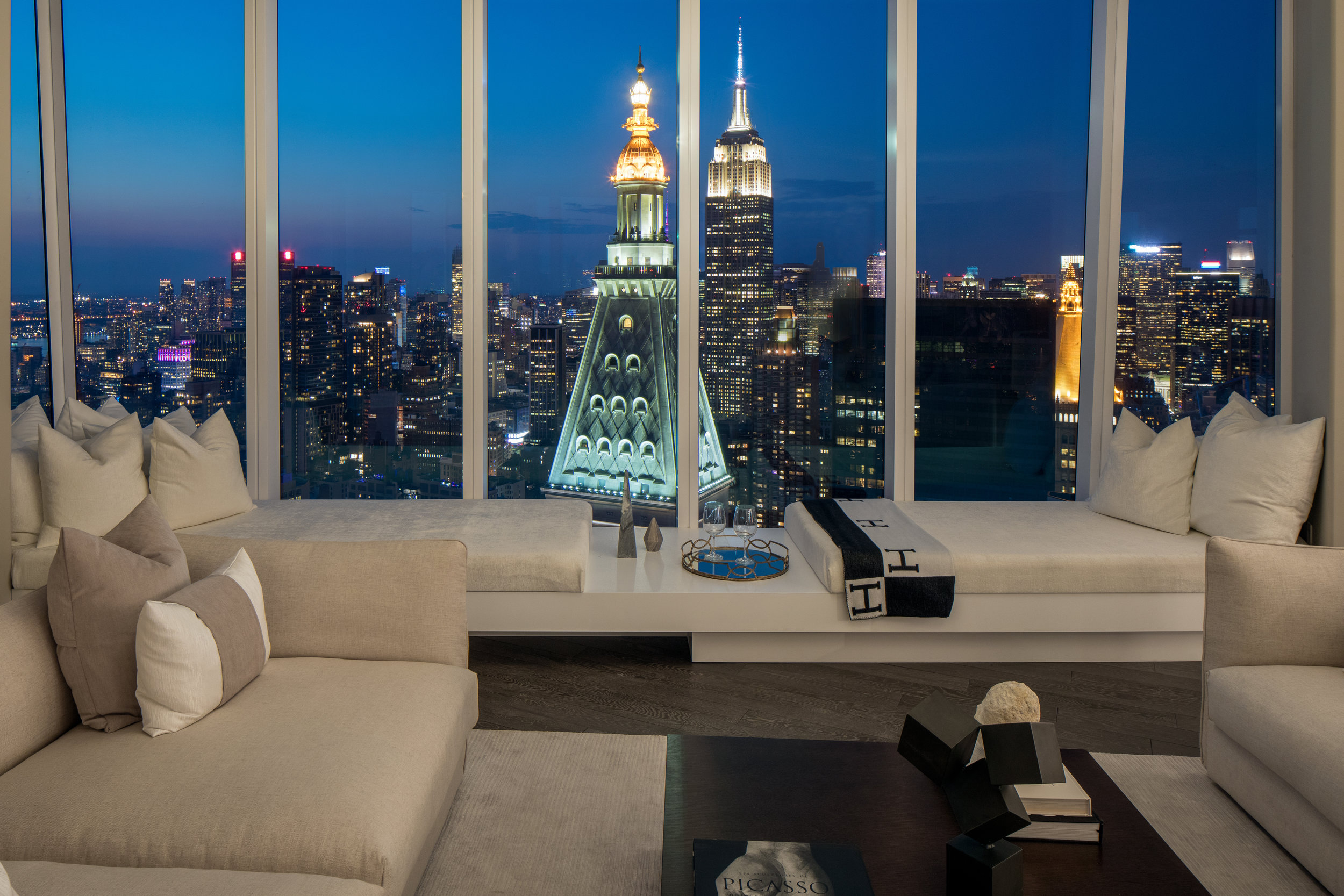
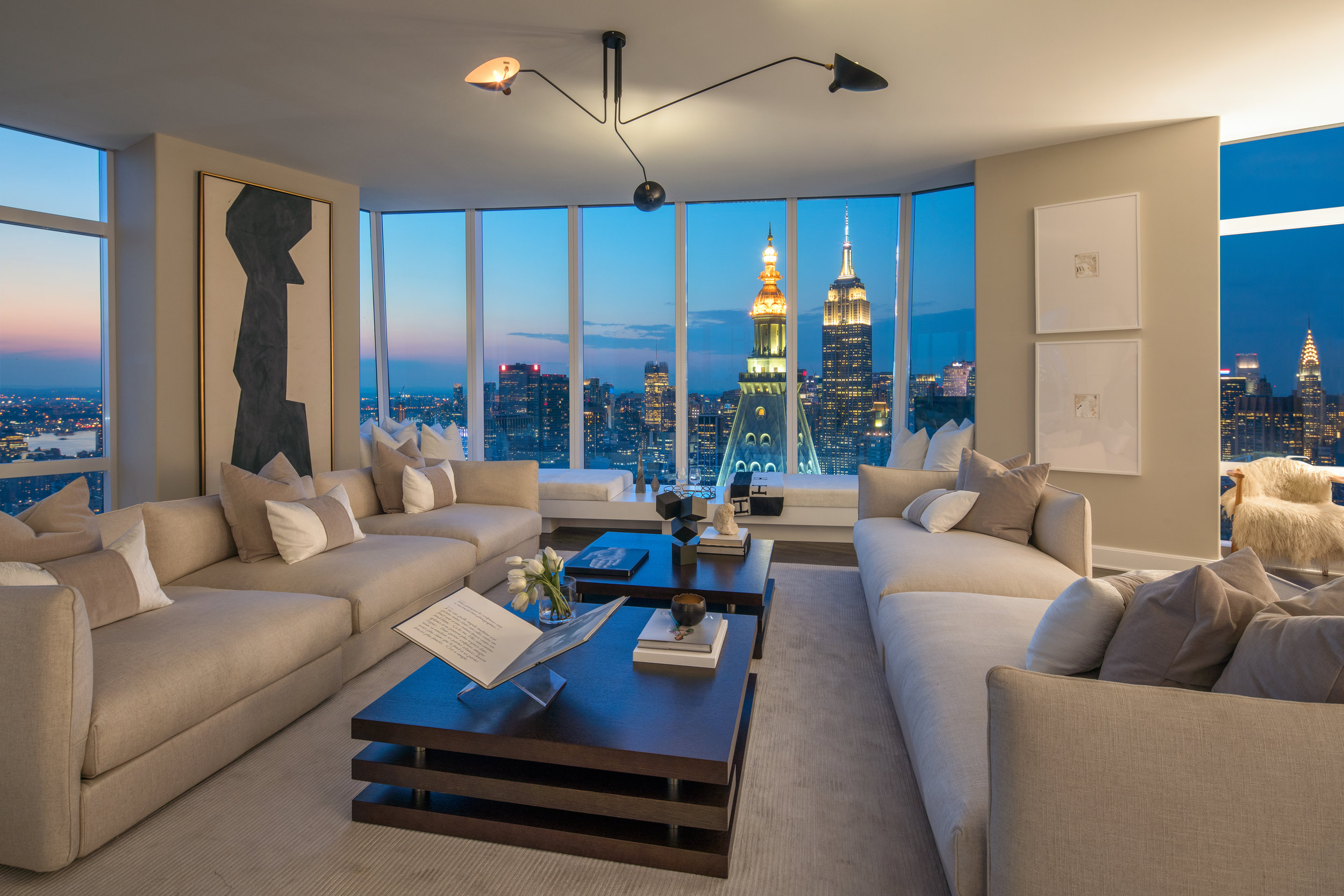
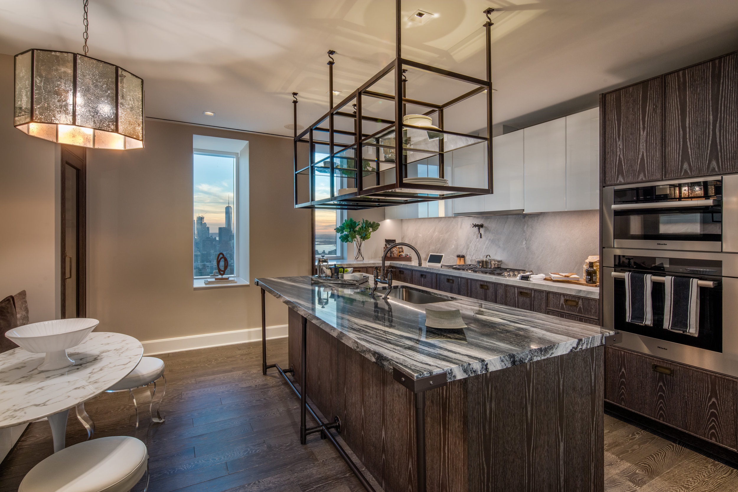
RW: Every residential tower is a response to the market conditions of the time when it was devised. Madison Square Park Tower was designed to provide bespoke apartments and living experiences for 83 condominium owners. Layouts, finishes, views, and amenities all played a role in the design. While the design team’s initial assessment was that the best views for the apartments would be south facing, working with Bruce changed our perception. The proximity to Madison Square Park, the Empire State Building and Midtown – particularly when illuminated in the evening – craft a kind of romance that swayed our decision to focus on views to the north. The chamfered corners of the tower act like huge bay windows and add corner views unobstructed by columns. The chamfer at the northwest corner allows the living room to face directly to the Empire State Building only twelve blocks away. These amenities are increasingly important to both the developer and resident.
PM: KPF is also working on a tower on the West Side at Waterline Square. Are there any signature features the firm aims to include when taking on a new project?
RW: At KPF, every project aims to better its local environment through the provision of open space, amenities, and appropriate scalar and material responses, all the while advancing the given typology of any given program. As a family of buildings, Waterline Square defines a large public park to its south and provides a mix of inclusive housing with its condominium program. Given the strict confines of a previously approved scheme on its site, the design of 2 Waterline Square employs creative planning and massing adjustments fit for the program without sacrificing the positive experience of its outdoor space.
PM: What does KPF want its buildings to mean to the city of New York and its evolving skyline for the generations to come?
RW: KPF desires its buildings to provide a comfortable backdrop to the lives of their inhabitants while introducing the excitement and awe that the Empire State Building, Chrysler Building and Seagram Building present – the best buildings of their age.
About Robert C. Whitlock:
Robert Whitlock is the Design Principal at Kohn Pedersen Fox and has played a major role as a designer of high-rise towers, mixed-use developments and large-scale master plans enhancing the urban experience as about shaping individual buildings. Since beginning professional practice over 30 years ago, Rob has focused on density, public space, programmatic integration, supertall building, and the influences of these elements on the quality and sustainability of the “global city.”
Rob has designed some of the most iconic towers across the globe including Hysan Place, the first LEED Platinum building in Hong Kong; Wheelock Square, the tallest building in the Puxi district of Shanghai; the AZIA Center and CSCEC Tower, both in the Pudong District, China’s financial and commercial hub; Suzhou International Finance Center, a 450-meter building for Wharf Holdings and the Chongqing International Trade and Commerce Center; Marina Bay Financial Centre in Singapore; BSD City, Jakarta’s largest exurban development, and the award-winning Singapore Exchange Center (SGX Center); and in the United States, Rob has overseen the award-winning design of the Espirito Santo Plaza in Miami, which houses bank headquarters, hotel and residential components, and was the recipient of a Design Award from the New York Chapter of the American Institute of Architects.
Rob has been an active member of the AIA for more than 20 years and is frequently asked to serve as a guest lecturer and presenter. He has also participated in the Architectural Record Design Roulette in Singapore (2011), the Green Building Conference in Singapore (2011), and the Ultra High Rise Building Conference in Shanghai (2011), and the Smart Geometry Conference in New York City (2008).
Photos via Will Femia (exterior) & Evan Joseph (interior)


